
Dude where's my grant?
Vibe coding my way to a product and maybe a grant, one blog post at a time. By JUNC Founder Noah Allen, PhD


Funding Cuts Are Lost in the 24-hour News Cycle
Last month my scientific (and life) partner and I submitted our first letter of intent for an aging research grant from The Glenn Foundation for Medical Research. A few weeks later, we found out we have approximately a 3% chance of moving on to the next round. After several hundred job applications between the two of us, it feels like we are going a little crazy.1 Fortunately our current contracts have kept us employed for the time being. We are both grateful for the support we have as postdoctoral researchers, but unlike actual purgatory, our appointments will end sooner or later. To set up our careers for the next step we are both searching for new funding sources.
Navigating the various NIH portals and announcement pages for government research funding is daunting. Landing new grants was not a concern as a grad student in a high-functioning funding environment; I paid little attention to the mechanisms of the NIH Grant Opportunities page. But lately I’ve been filtering through the opportunities available and noting the acceptance rate of each participating organization. Acceptance rates vary year to year across the 27 NIH institutions; keeping track of these are part of the game when planning your next submission.
This got me thinking: There has not been much reporting on what’s going on with grant funding, but insider sources in academia keep telling us about grants not being paid out or invasive financial audits of top-tier academic institutions. There are very serious modifications coming to grant review practices as directed by the Office of Management and Budget, including review by “senior appointees” (read as: non-scientist, politically appointed staffers). The full legislature can be read here. These changes are expected to slow and disrupt the flow of funding in the U.S., greatly stunting our growth of scientific research. Plainly it is a harassment of scientific productivity at academic institutions. But this also means keeping track of where the money is flowing and what type of work is being supported is more important than ever.
So What Am I Going to Do About It?
What if we had a better tool to track the funding situation? Instead of pulling down yearly spreadsheets of data and combing through them manually, a usable tool would be nice to have. Maybe it would be clearer to see how funding levels are changing, who is losing out, and who is being favored. So, I set out to vibe code my way to a NIH funding tracker tool. Using my newfound skills of full-stack development (see: I went to an AI Hackathon) I built a tool to follow grant funding and discover anomalies in NIH spending. Like they say “follow the money.”

The First “Oh crap” Moment
Turns out the NIH Research Portfolio Online Reporting Tools (RePORT) website has a pretty slick dashboard already. But we will prevail. Let’s take a look at what they have:
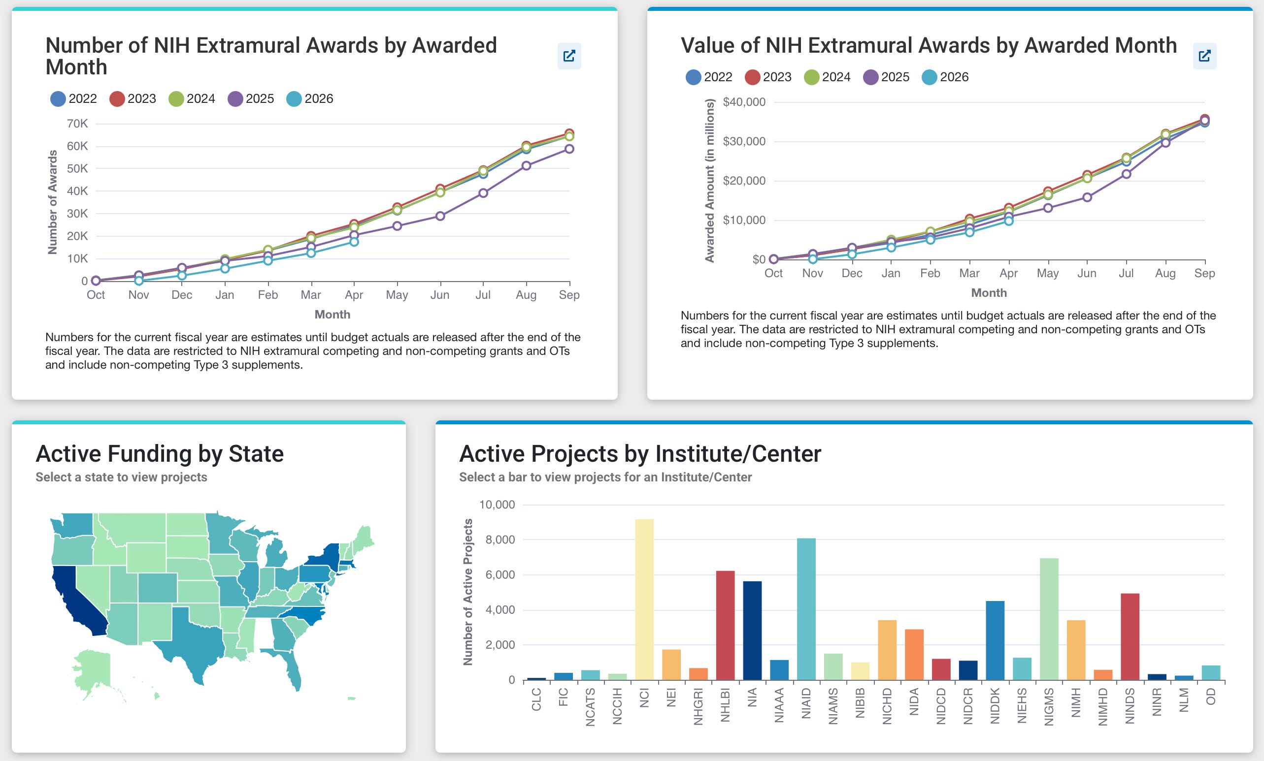
Well, they did a pretty good job, and the more you click through, the more drill-down options become available. Transparency could be closer than anticipated! Might as well learn from what they’ve already made. First thing noted is the decline in funding and rise in applications, thus driving the overall success rate below 20%.
Also apparent is the lag in funding for FY2025 and an even worse lag in FY2026. While the number of awards remains behind previous years, the total value of awards appears steady This is due to changes in NIH funding policy requiring upfront payment for the full award, rather than yearly installments which allowed the NIH to stretch its budget across more grants each year [1]. Kind of like if your company paid your full salary for the next five years on day one, then leaving no room in the budget to hire anyone else that year. So awards are getting more competitive as the extra slack in the budget evaporates.
The tools offered by NIH RePORT do a good job of showing the most important and digestible data. First glance gives you what you need to know in terms of who is funded, where it’s going, and how competitive the landscape is. Harder to piece together is where the funding is going and how that changes year over year. The tools are there, but it requires a lot of guess-and-check to hit on something interesting. So there’s room for improvement on quickly identifying winners and losers year to year.
Enter: GrantWatch


The Build
Well no time to waste, let’s start downloading data. I’ll spare you the details for now, as we are far from the final form... After trial and error downloading from the NIH RePORTER API, I gave up and downloaded the eight years of data from their repository myself [2]. This takes us back before the COVID tailspin. Later I fixed up a script which handles updating data in my local database as the NIH releases new updates.
First pass look at the data: there are about 65,000 records per year, with 46 data fields containing identification codes, location, recipient information, keywords, full abstracts, grant duration, and cost data. This is incredibly rich information and exactly where I’ve found working with AI to be useful. Parsing this information for visualization would have taken me a serious amount of time; for this project it only took about an hour to go from downloads to functional dashboard. The incredible thing is how well the AI could single-shot the whole project. Once I had a prototype, my work was focused on getting the right filter options and scaling the figures to be readable.
The Insights
Even though what I built here ended up being very similar to the actual data dashboard sponsored by the NIH, there are a few important notes about insights from the data.
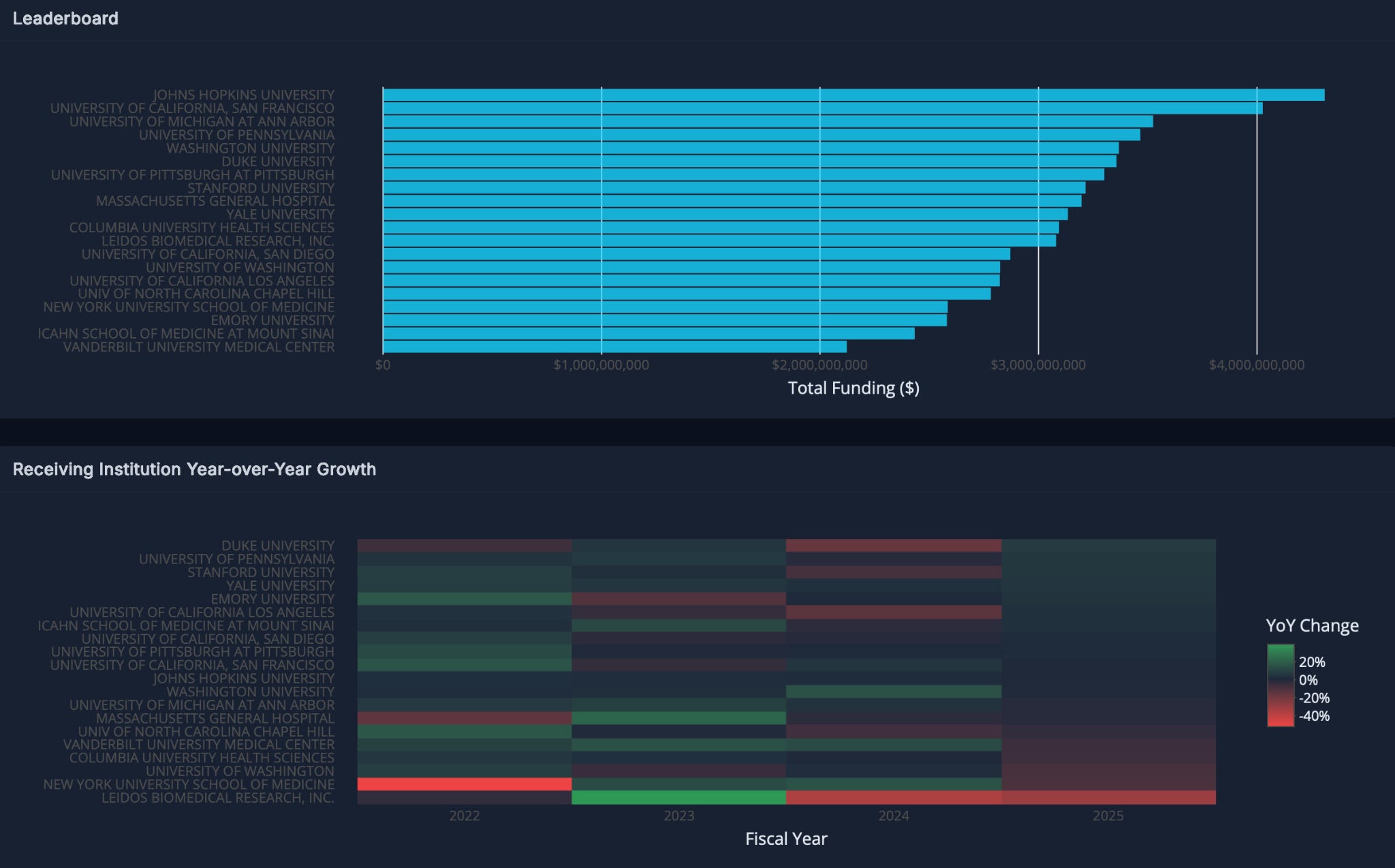
Heat map plotting of year over year change. This was the single most important calculation and plot generated by having access to the raw data. As seen below, the top 20 receiving institutes (not including intramural NIH labs2). Leidos, a government contractor, has had the steepest decline in the last two years. Just above them you can see other institutes which lost significant funding in 2025, including Columbia, Massachusetts General Hospital, and University of Michigan. One notable group not shown here is the Research Triangle Institute, which had a -71% change in funding from 2024 to 2025. But not all institutions were losing funding; some in fact gained. This display helps track where the government research money is moving.
Grant funding opportunities compared to historical averages. The dashboard was nice, but I quickly realized making a dozen plots and hoping someone else would extract meaning from them was a trap; it led to a mock up essentially identical to the NIH RePORT page. Instead, I had already built my own database and plotting scripts with an AI tool that knows the data better than me. So I turned to natural language queries to aggregate data and plot it. With this approach, you can find a thread and start pulling.
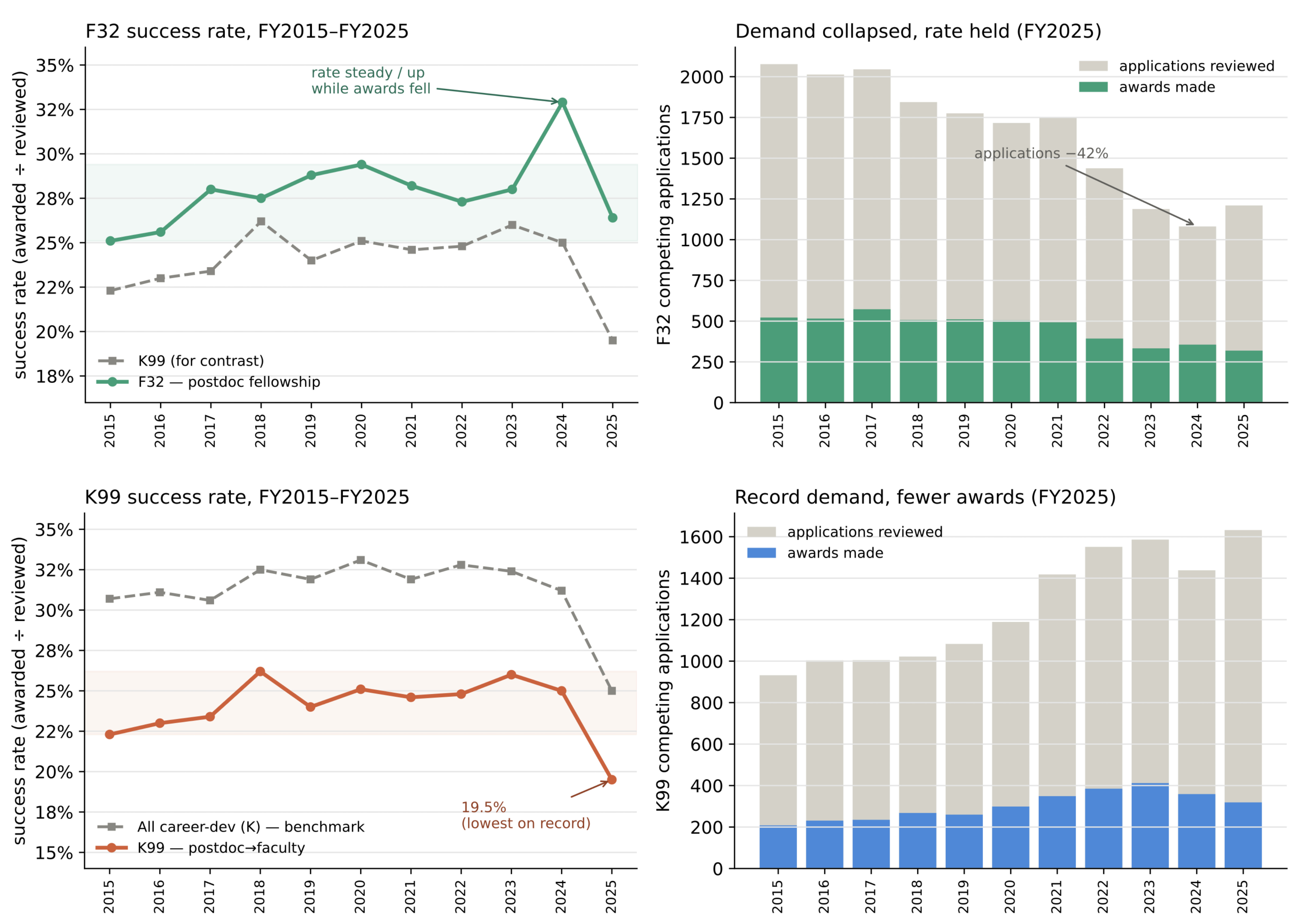
I mentioned earlier that comparing funding sources is a key part of planning where to apply next. As a postdoc looking for research funding and transition awards, I want to improve my chances by targeting the right agency. So I started digging into the F32 and K99 postdoctoral grants. Almost immediately, based on the F32 and more recently in the K99, we see a drop-off in the number of awards.
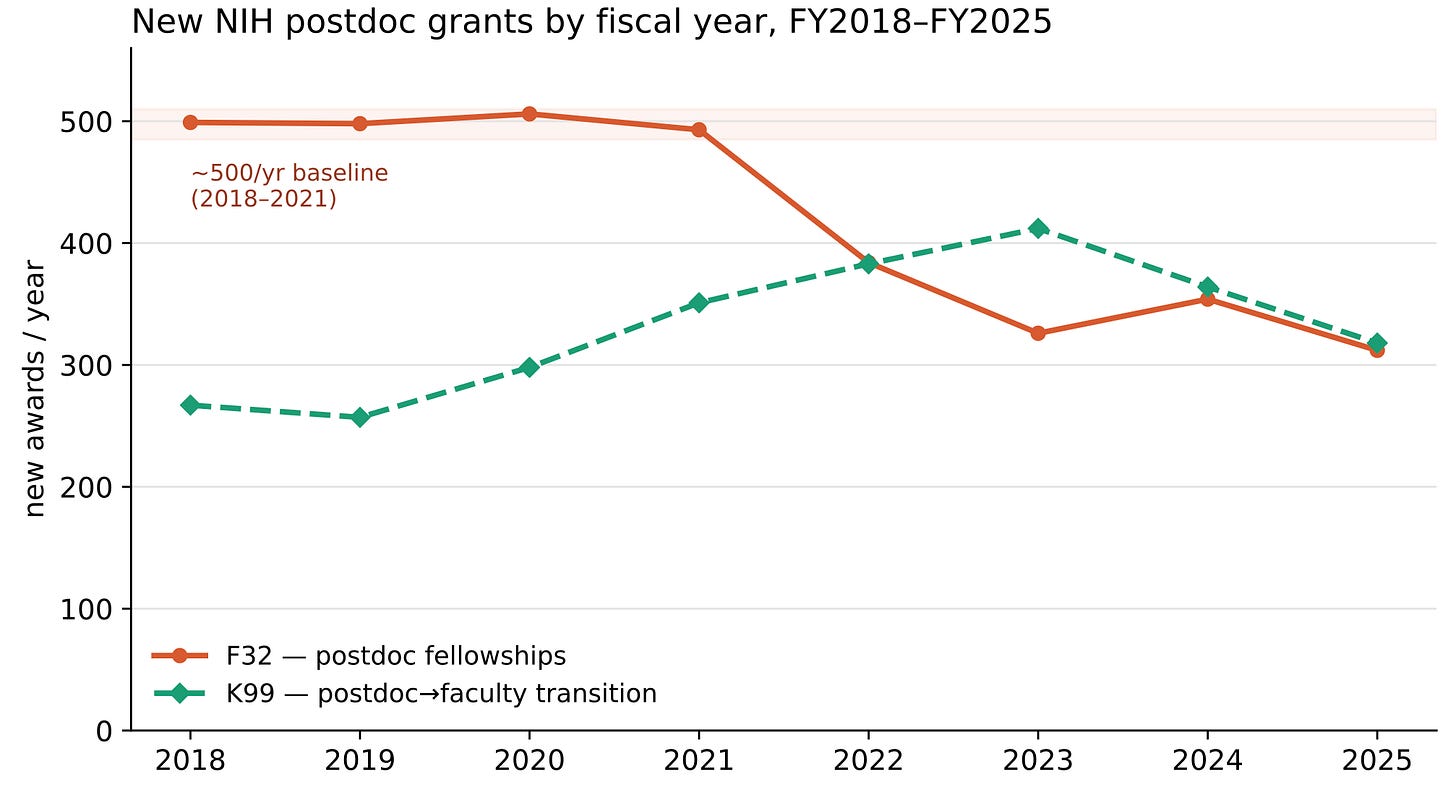
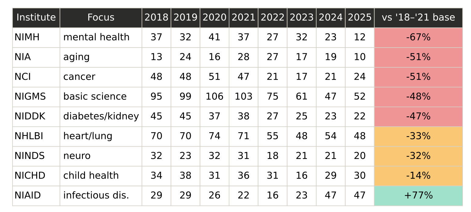
F32 and K99 awards by year. In terms of the F32, this decrease in the number of awards is seen across almost all NIH institutes.
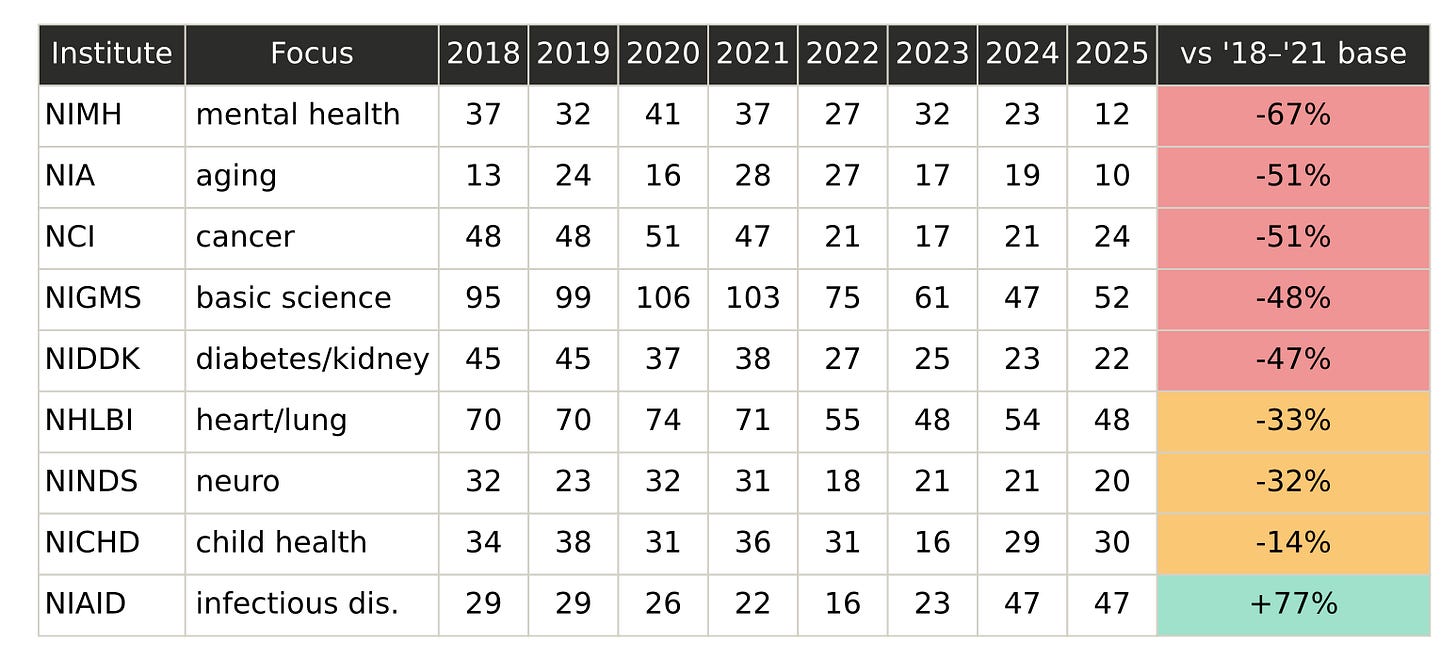
F32 award numbers by NIH institute. However, this data only takes into account the number of awards, not the success rate based on the total number of applications. This data lives in another spreadsheet not included in this database. Having this part of the story will inform how supply and demand are changing grant outputs.
Success rates prove the F32 is less appealing and the K99 is harder to earn. Pulling more data from the NIH fact book [3] gives us the number of applications and awards broken down by institute and award group. Now we can see F32 interest is actually decreasing: in 2024 applications were down by ~42%. Maintaining the same rate meant similarly shrinking the number of awards. On the other hand, the K99 story is looking rough: there's been less funding and fewer awards in recent years. At the same time, demand is jumping, directly driving down the success rate below 20%.

Financial value of postdoctoral training grants
I don’t know why sentiment has shifted like this. During my graduate education, F32’s were often talked about as prestigious funding opportunities. But somewhere in the 2010s researchers got wise to the difference in incentives. A F32 pays salary for three years with no spending for research. A K99 award pays salary plus ~$25k in research spending. Assuming you’re already associated with a well supplied lab (a requirement of receiving any of these awards), extra funding goes a long way to achieve your own research goals. This advantage is paired with the pipeline to the R00 award phase which gives awardees ~$250k per year. So if you’re working on furthering your career and have to write a career-defining grant at the end of your PhD or first year of postdoctoral work, which would you choose?
Finally, what we don’t see
When numbers get this big, it’s easy to lose sight of what we’re talking about. Seeing a $1,000,000 award value lands as, “Gosh what could I do if someone handed me a million bucks!”.
But when you watch the award get carved up over several years for salaries, institutional overhead, reagents, publication fees, and conference travel, there’s not much of the pie left over, and it sure doesn’t feel like a million dollars in the bank anymore. The gap between the headline award figure and what reaches the lab bench is where political rhetoric kicks in to paint scientists in a bad light. We watched this unfold in 2025 as DOGE mocked researchers for wasted funds, all while incorrectly accounting for spent money from cancelled grants as savings for American taxpayers [4].
Actual dollar figures for economic impact of NIH-sponsored research funding have been calculated: recently it was estimated every NIH dollar equates to $2.56 of economic activity [5]. But how can we track and share this real-time effect? I want to know how many patents were filed, how many jobs were created, how many clinical trials passed, and ultimately how many cures were discovered? This data seems hard to quantify and even harder to connect to the grant spending that happens behind the scenes. But that’s the next goal for this series. We will dig into the actual reporting to see how it is quantified and aim to generate some novel methods to connect the research spending to the economic outcomes.
References
[1] https://www.congress.gov/crs-product/IF13131
[2] https://report.nih.gov
[3] https://report.nih.gov/funding/nih-budget-and-spending-data-past-fiscal-years/success-rates
[4] https://www.science.org/content/article/are-terminations-nih-grants-wasting-billions-taxpayer-dollars
[5] https://news.harvard.edu/gazette/story/2025/03/nih-funding-delivers-exponential-economic-returns/
Footnotes
For a deep dive on this read more here:

NIH Intramural grants account for ~$4.7B annually.